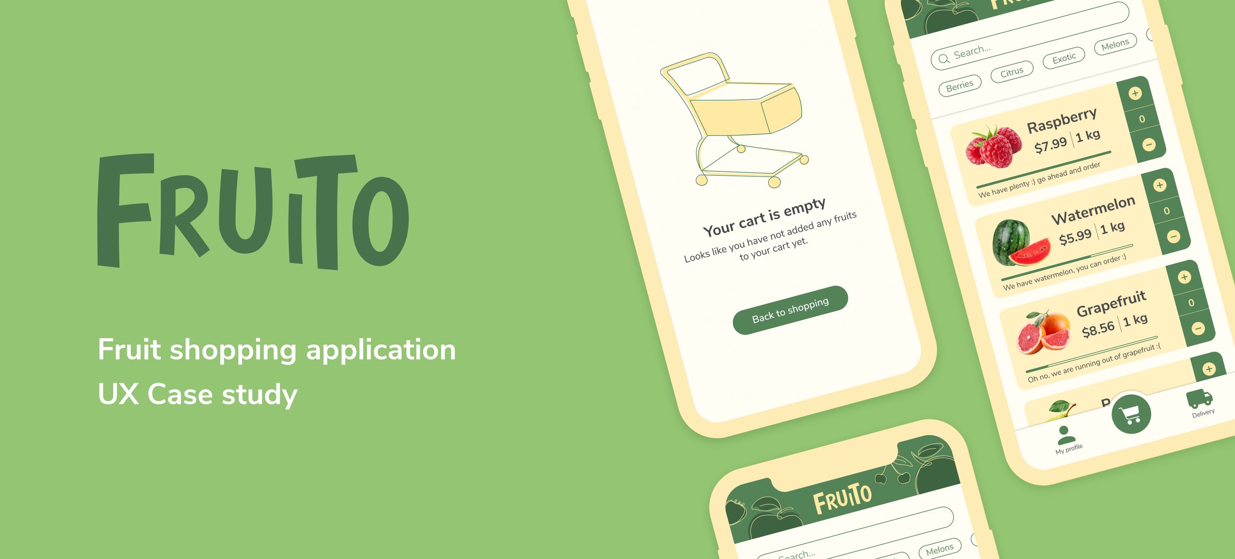
Overview
Fruito is a fruit shopping application that I created from identifying a problem to a final design through research, ideation, and UX design principles.
Role: Semi-structured interviews, surveys, affinity mapping, sketching, wireframing, A/B testing, prototyping
Tools: Figma, Miro, Adobe Illustrator
Duration: 2 months
The Challenge
How can we improve the fruit ordering experience?
Since the pandemic has changed our regular daily routines, most of us rely heavily on digital products to do grocery shopping.
I was interested in creating a mobile app that aims at optimizing online fruit shopping and delivery service for young families, who are within their 6 years of marriage with 1 or 2 children, and who consume fresh, healthy food and rely a lot on online grocery delivery.
The Process
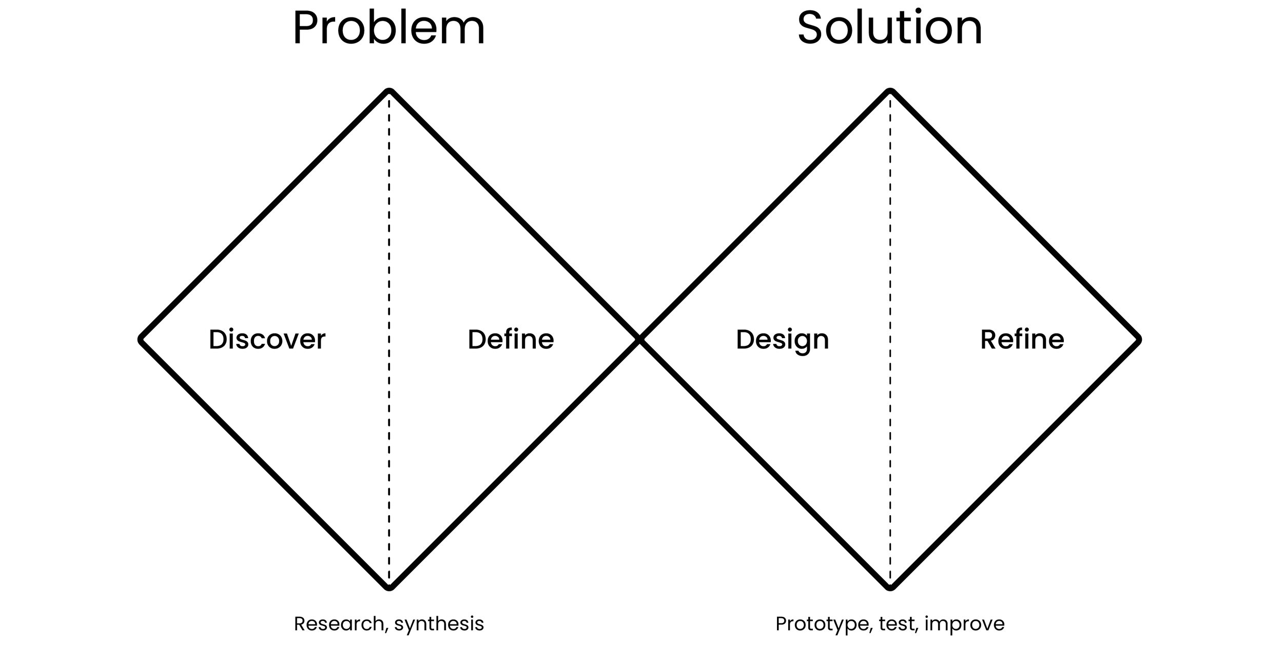
I decided to use The Double Diamond of Design for my process. It is a handy process guide that helps to stay on track.
Research
Research began with Semi-Structured Interviews with the target audience to gather qualitative data. I wanted to learn how young families use digital tools to order fruits/groceries, including how they achieve their goals when using these tools, and determine what opportunities and needs might exist for new fruit shopping products.
I also conducted a survey study to get more data to understand better whether findings from interviews generalize to the larger population of fruit consumers.
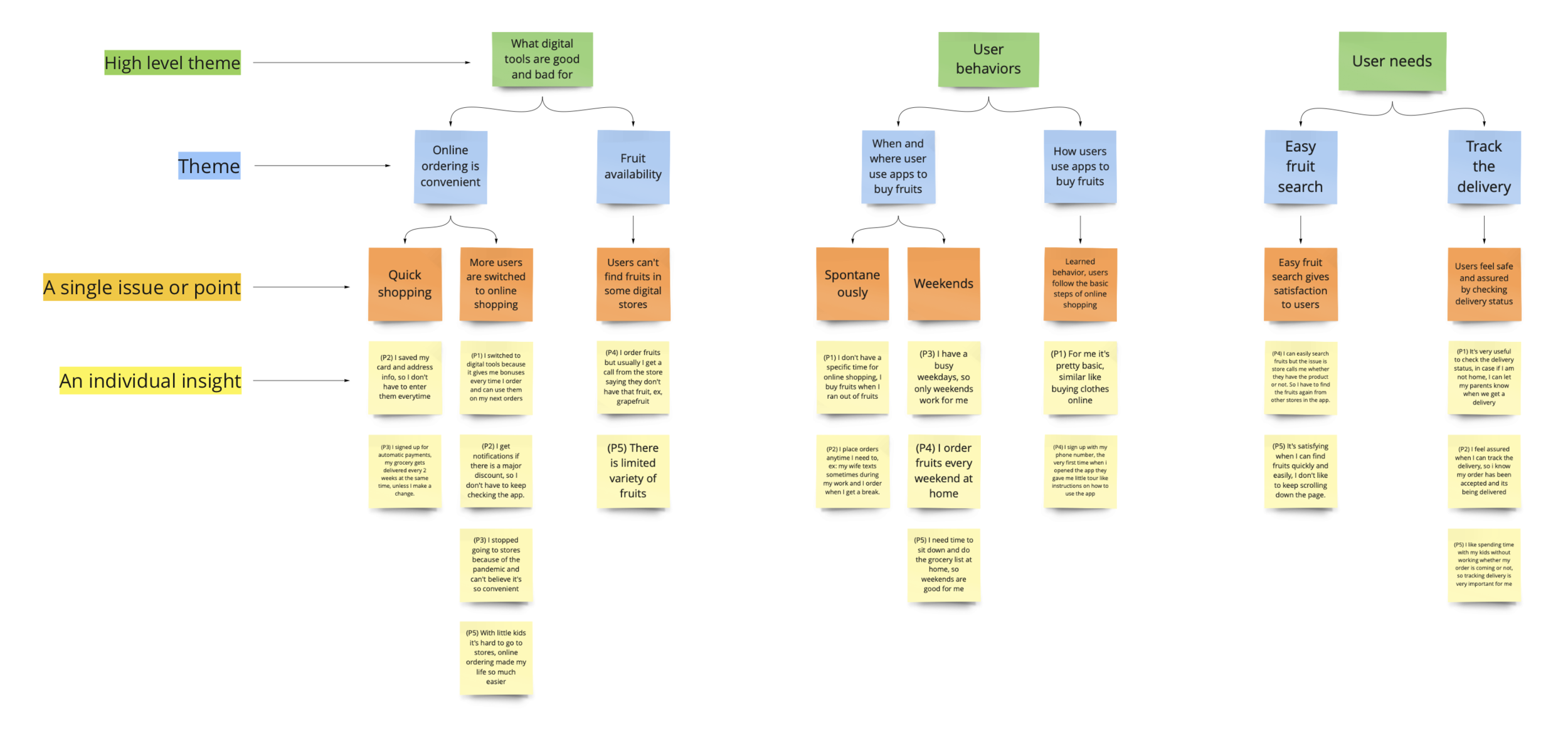
Affinity diagram from the interview
Key Finding #1
Participants don’t want to get disturbed once they place their orders.
“After I place my order, I usually get a call from the store saying that they don’t have a particular fruit that I ordered. It is frustrating because there is no indication of whether a fruit available or not. So, I assume they have it because it’s on the app.”
- Participant 4
“I don’t like getting a call from a store after I placed my order. Sometimes it adds extra work for me. For example, I ordered avocados, and after placing my order, I got a call saying they ran out of avocados. Then I have to search and order from other stores that use the app I currently use.
- Participant 5
Key Finding #2
Real-time delivery status gives users trust in the product and control of their time and plans.
“When I can see the delivery status, I somehow feel the trust. Especially when I move to a new city and start using an app for the first time that works in that area is intimidating. Seeing my order is being processed gives me trust that it’s working.”
- Participant 3
“I like spending time with my kids without worrying whether my order is coming or not. So, tracking the delivery is very important for me. Sometimes it’s fun watching real-time delivery with kids.”
- Participant 5
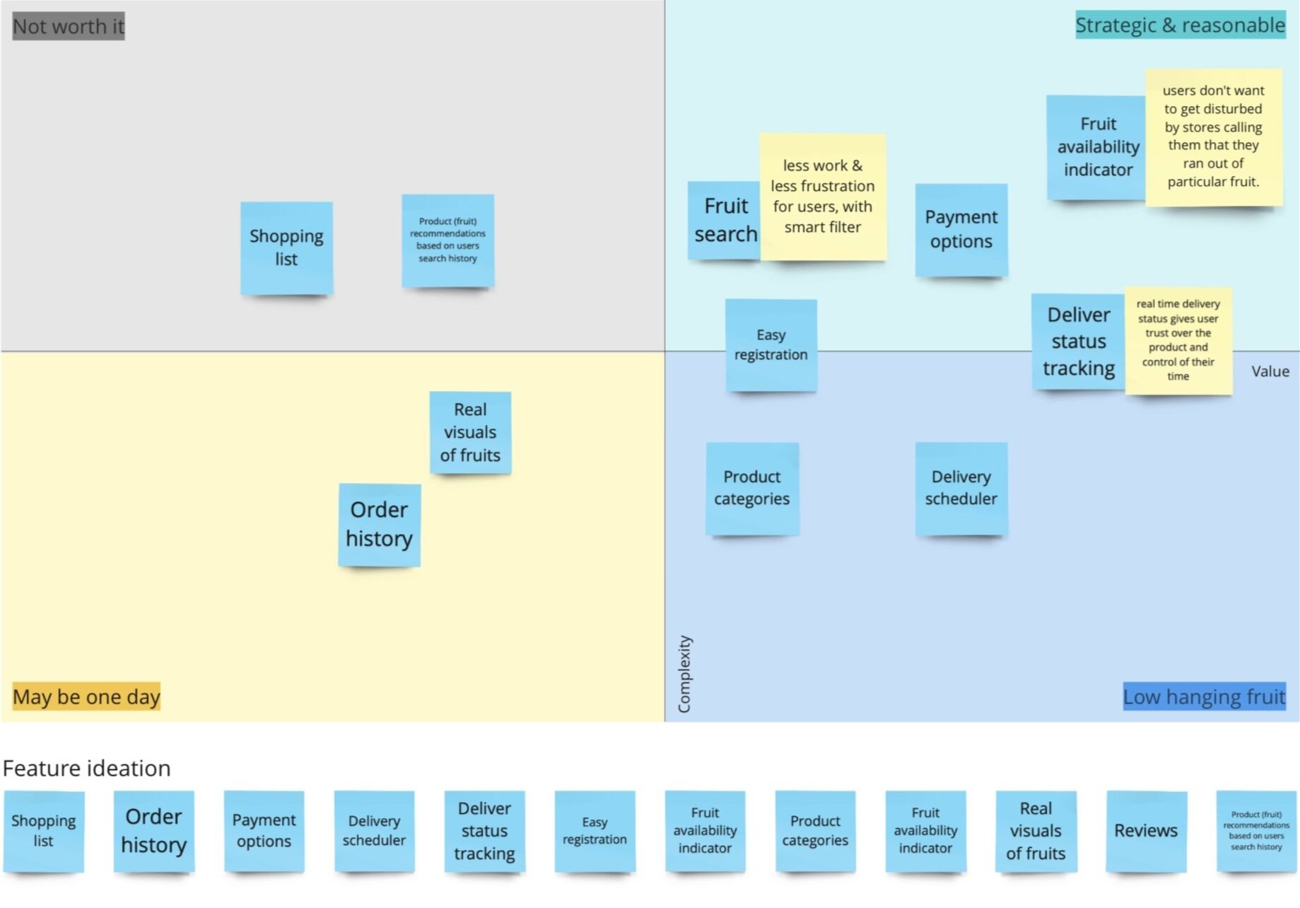
Feature Prioritization
I prioritized features based on interview/survey/observation findings. Suppose there were stakeholders and engineers in the team. In that case, feature priorities could have been different because I don’t know how each feature is challenging or time-consuming for engineers to build.
Sketching
& Wireframes
After researching existing products and websites within the grocery market, I began tackling potential solutions to users’ problems.
To create early-stage concepts and designs, I began doing Crazy 8’s (8 minutes creating 8 rough sketches-to get ideas out and repeat a couple of times).
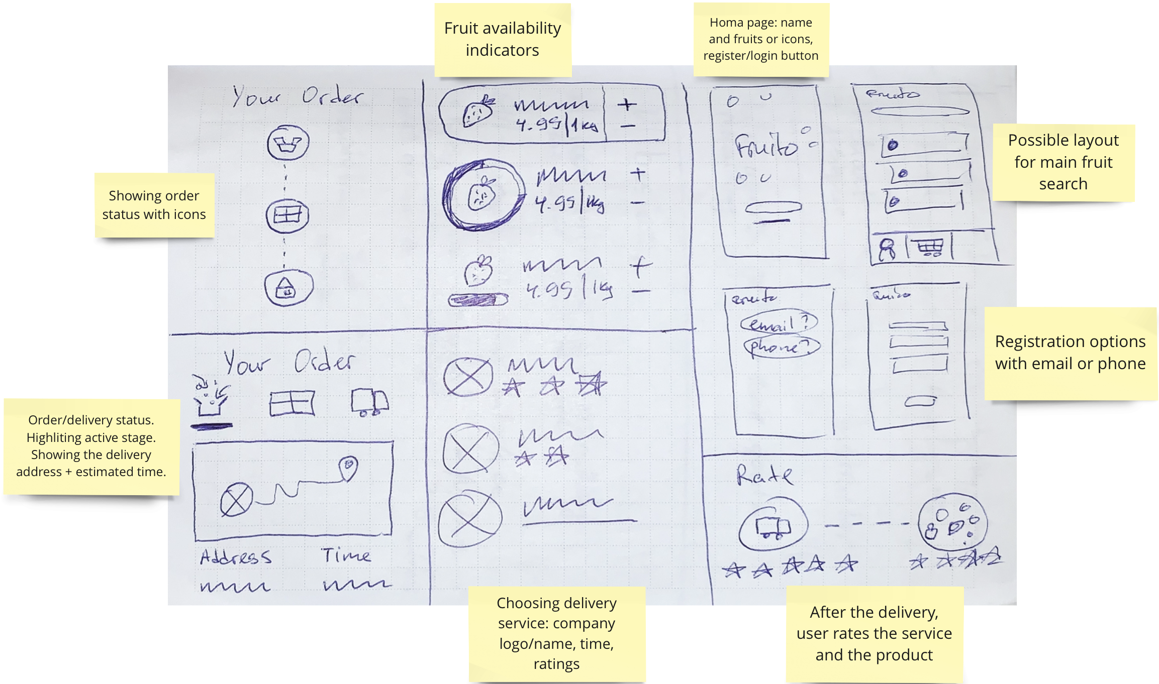
Crazy 8’s
Apply psychology to design
Low-fidelity mockups
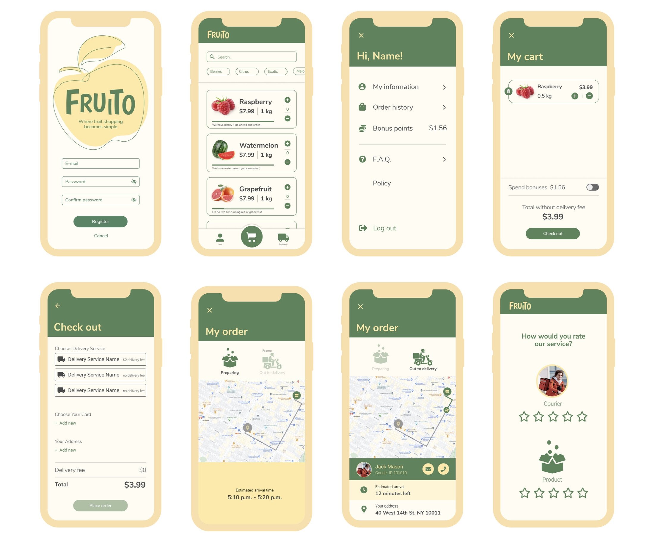
Figma Prototype Link: https://www.figma.com/proto/mFqMgGx8aArlFj0xuz9Piw/uxnd-fruito-Copy?node-id=6%3A0&scaling=min-zoom
Usability Study 1
I conducted an early-stage usability study from the low-fidelity mockup to see if people could use the app and recognize the elements on the page. Before testing, I scripted out questions and tasks for users to answer and complete.
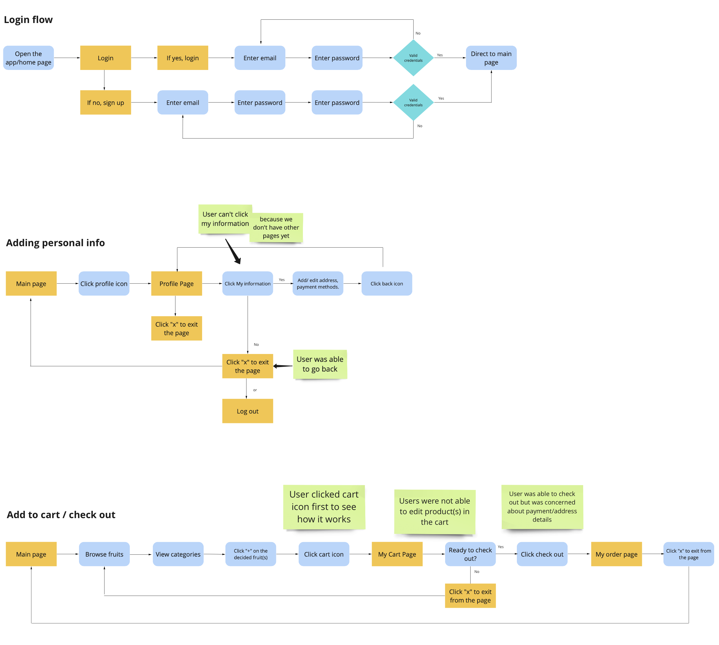
Key findings from usability study 1
I made notes of the positive and negative feedback to know what areas to keep expanding upon and what needed to be reworked.
Positive
Uses were able to complete tasks
Users satisfied with the search/filter section
Navigation was clear
Negative
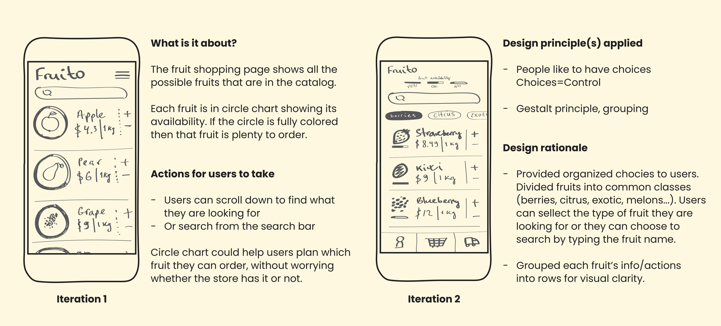
Users were not able to edit products in the cart
Users were confused with the fruit availability indicator but liked its usefulness
Iterate
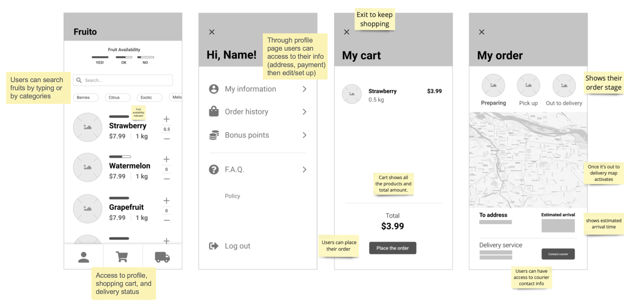
I made changes based on the users' feedback and created high-fidelity mockups.
Usability Study 2
I set up a remote usability study on LookBack with 18 people who participated from the target audience, completing set-of tasks on the app.
Task List
Create an account
Or login into the app
Add fruit to the cart
Remove fruit from the cart
Check the cart
Add card/address info
Place an order
Check delivery status
Rate the experience
Usability Study Insights
90% of users were able to login successfully
Need to highlight key buttons (+ and -) on the main shopping page, so they look cleaner and help users add/remove fruits easily to the cart
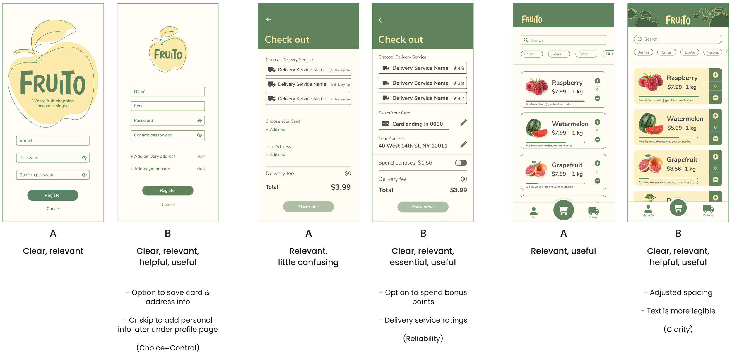
65% drop off rate at check out
78% of users do not prefer separate ratings (rating for product & rating for courier). To rate the product, users should open the box and check, and it takes time.
KPI: Increase Task Success Rate
Decrease the number of incomplete orders
65% drop off rate at checkout
Hypothesis: We believe saving card information and delivery address on the second step of registering to the app will increase the number of completed orders.
A/B Testing
It’s not about how certain elements look on the page; it’s about how important the user feels about the given information.
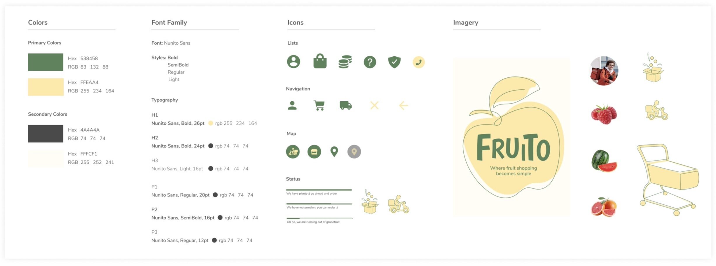
Style Guide
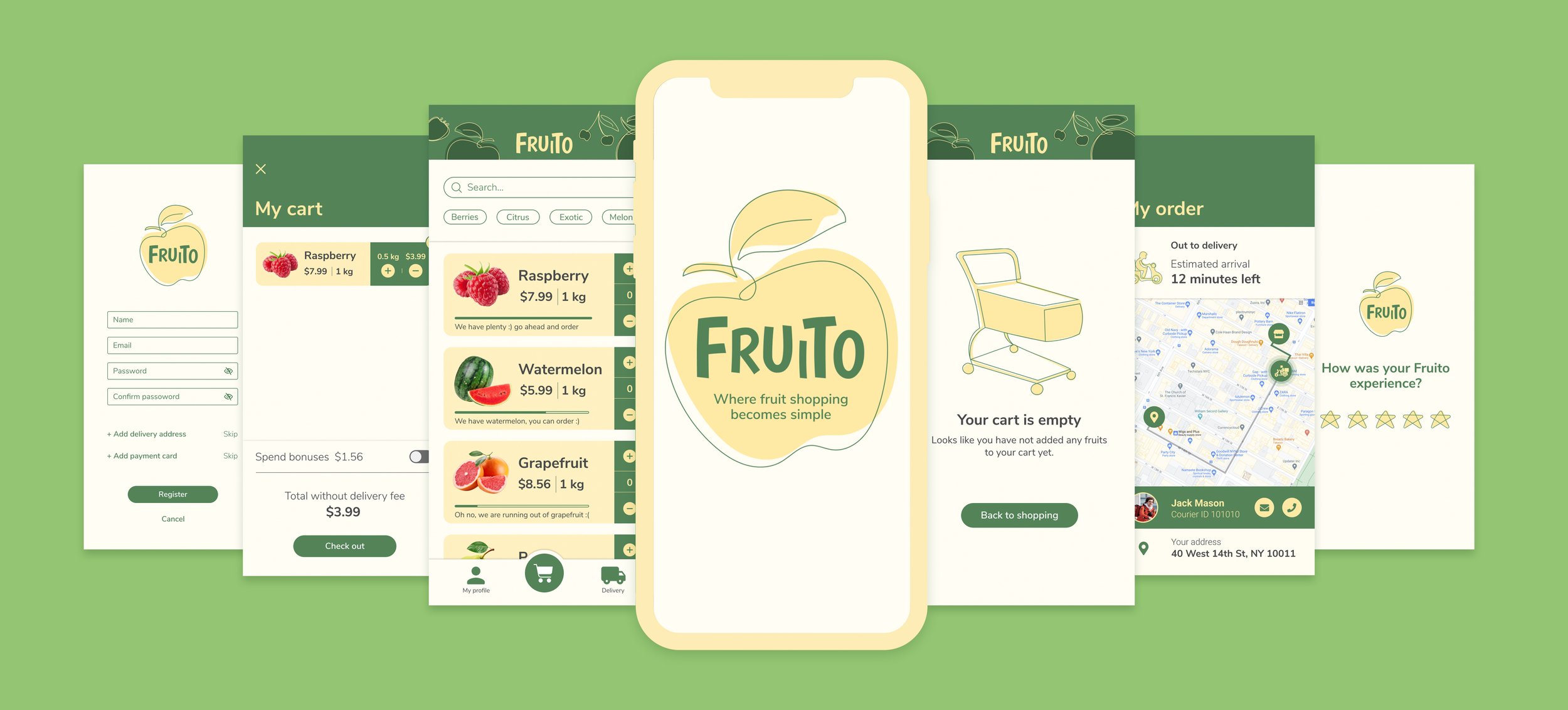
Final Product
Takeaways
This project was a great learning experience. I also gained a working knowledge of industry-standard tools such as Miro and LookBack. Miro is a useful tool for creating user flows and digital affinity maps. In the future, I would like to expand my skills in using LookBack because it was my first time using it.
What can be improved?
I believe Fruito will benefit from interaction design rework. I have a few features that are not yet available on the clickable prototype that I would like to add in the future.