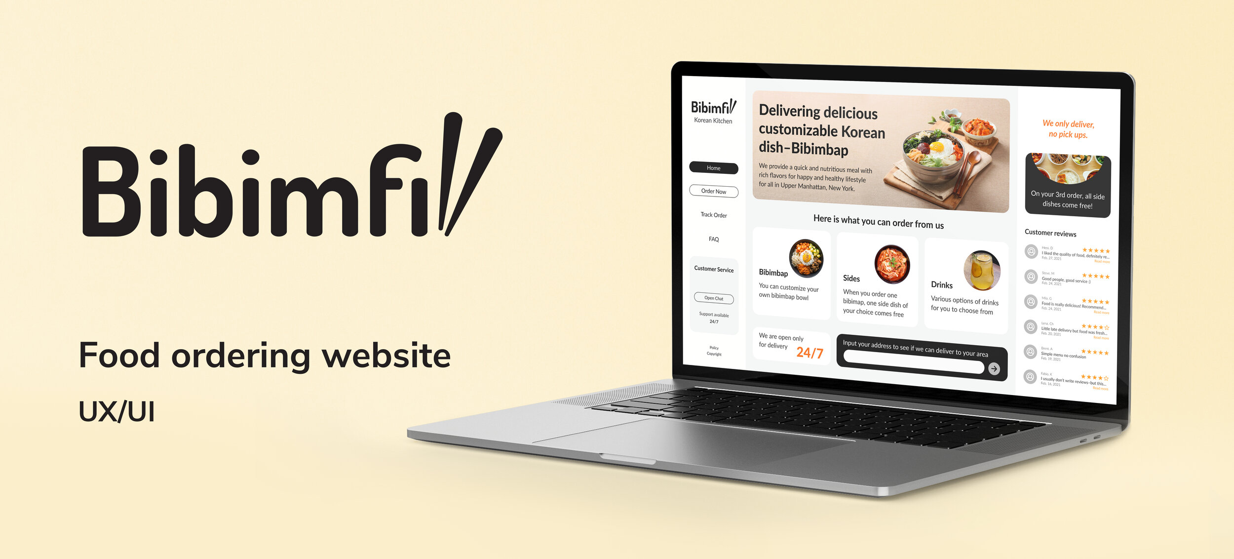
Project Overview
I planned and designed a responsive website for a restaurant business and came up with the business name and brand identity as a part of my UI/UX Design Specialization from CalArts.
Role: Research, Strategy, Sitemapping, Wireframing, User Testing, Prototyping
Tools: Figma, Adobe Illustrator
Duration: 3 weeks
Restaurant Concept
It is a delivery-only restaurant that delivers food & drinks to customers living nearby. The centerpiece of the website is the online food customization and ordering system.
-
Bibimbap is a Korean dish served as a bowl of warm rice with various ingredients.
-
$-affordable
-
Base: white rice, brown rice, green salad, japchae noodles
Protein: chicken, steak, tofu, veggie
Hot toppings: potatoes, black beans, bean sprouts
Cold toppings: carrots, kale, cucumbers, corn, red cabbage, moochae, eggs, cheese
Sauce: spicy sriracha, yum-yum, sesame ginger, cucumber wasabi, gochujang
Sides: kimchi, spinach, pineapple, pickled radish, seafood pancake
Strategy
Target Audience. The website will focus on the following target audiences:
Roles
Late-night studier
Busy people/students who can’t cook and rely on food delivery
Bibimbap lover-who is looking for affordable food
Demographics
Age-between 18 and 50 years
Education-college education or higher
Occupation-college students, full-time workers
Income-limited income people can afford it too
Location-urban, upper Manhattan area, New York
Martial status-doesn’t matter
Gender-everybody
Psychographics (personality, values, attitudes, interests, lifestyle)
Personality & Attitudes:
Youthful
Professional
Classy
Attention to detail
Values:
Health
Safety
Open-minded
Interests/Lifestyle:
Active
Studios
Like hanging out with friends
Study/work breaks
User Needs
The website needs to enable the user to:
Find out if the restaurant delivers to their area
Customize the order
Easy to understand menu
Order food online
Track the delivery/status of the order
Find the restaurant’s working hours
Contact someone with questions or issues with an order
A bonus point/discount would be plus
Client Needs
The website needs to enable the client to:
To sell food online that will be delivered
Provide a system for order customization
Provide communicative service to answer questions quickly
Explain what bibimbap is for the people who try it for the first time
Communicate freshness, reliability
Communicate affordability
Appear professional
Outline of Scope
Content Requirements
Content (text, images, videos) that the user will need. ”The user will be looking for…”
Food Menu/images of food items
Bibimbap
Sides
Drinks
Prices
Delivery radius
Working hours
Chat box
FAQ
Where do you deliver?
Do you charge for delivery?
Can I cancel or modify my order once it’s been placed?
What is Bibimbap?
Who can I contact with questions?
Functionality Requirements
Systems that will allow the user to accomplish tasks. ”The user will be able to.…”
Enter zip code/exact address to check delivery radius
Create customized bibimbap bowls
Base
Protein
Hot toppings
Cold toppings
Sauce
Sides
Add items to the shopping cart
Check out
Contact information
Enter payment info
Enter delivery address
Get order confirmation
Get help via a live chat feature
Sitemap

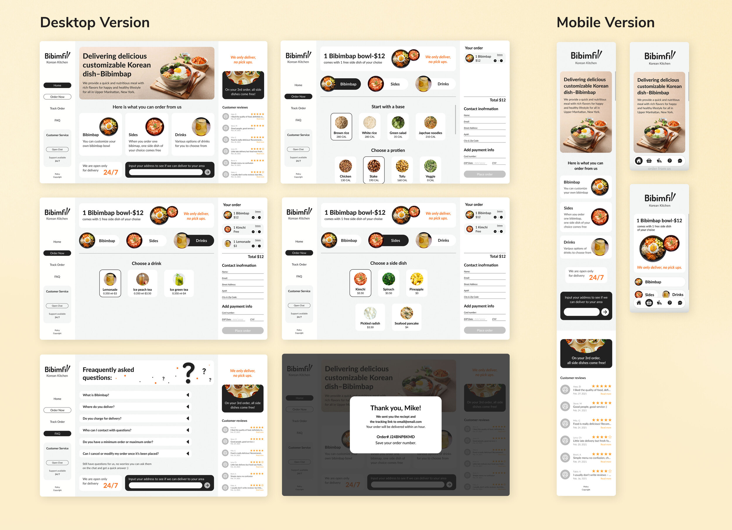
Wireframes
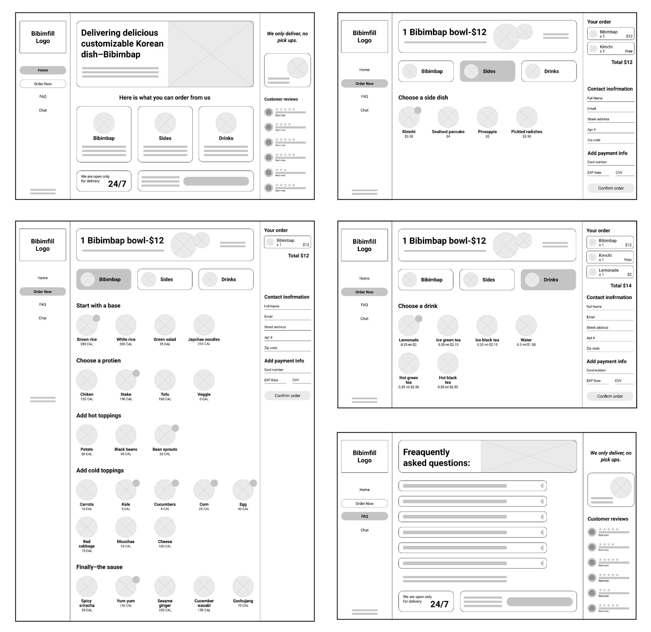
Desktop version
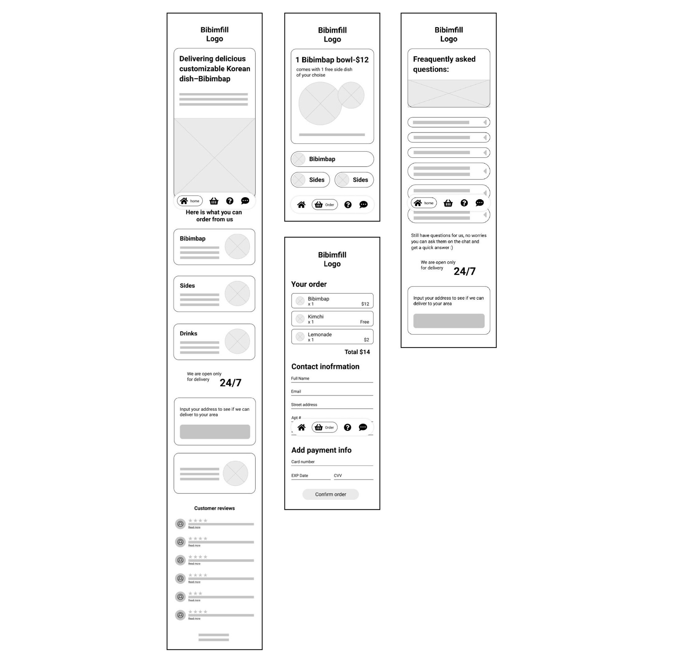
Mobile version
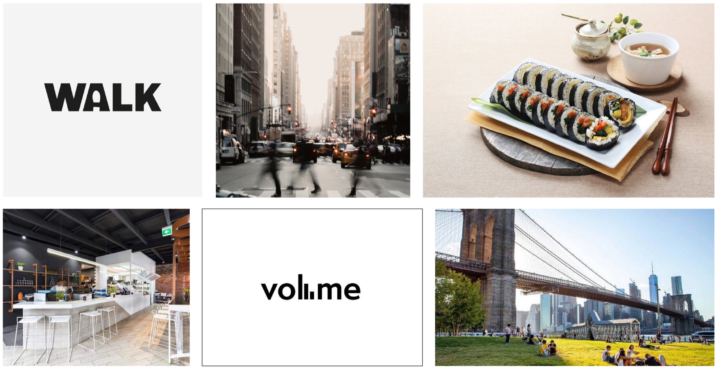
Moodboard
I created this moodboard, given that our users are busy people living/working in the city. Using aesthetically pleasing food photography, keeping the design simple and straight to the point, and using minimal color feels friendly, clean, and approachable.
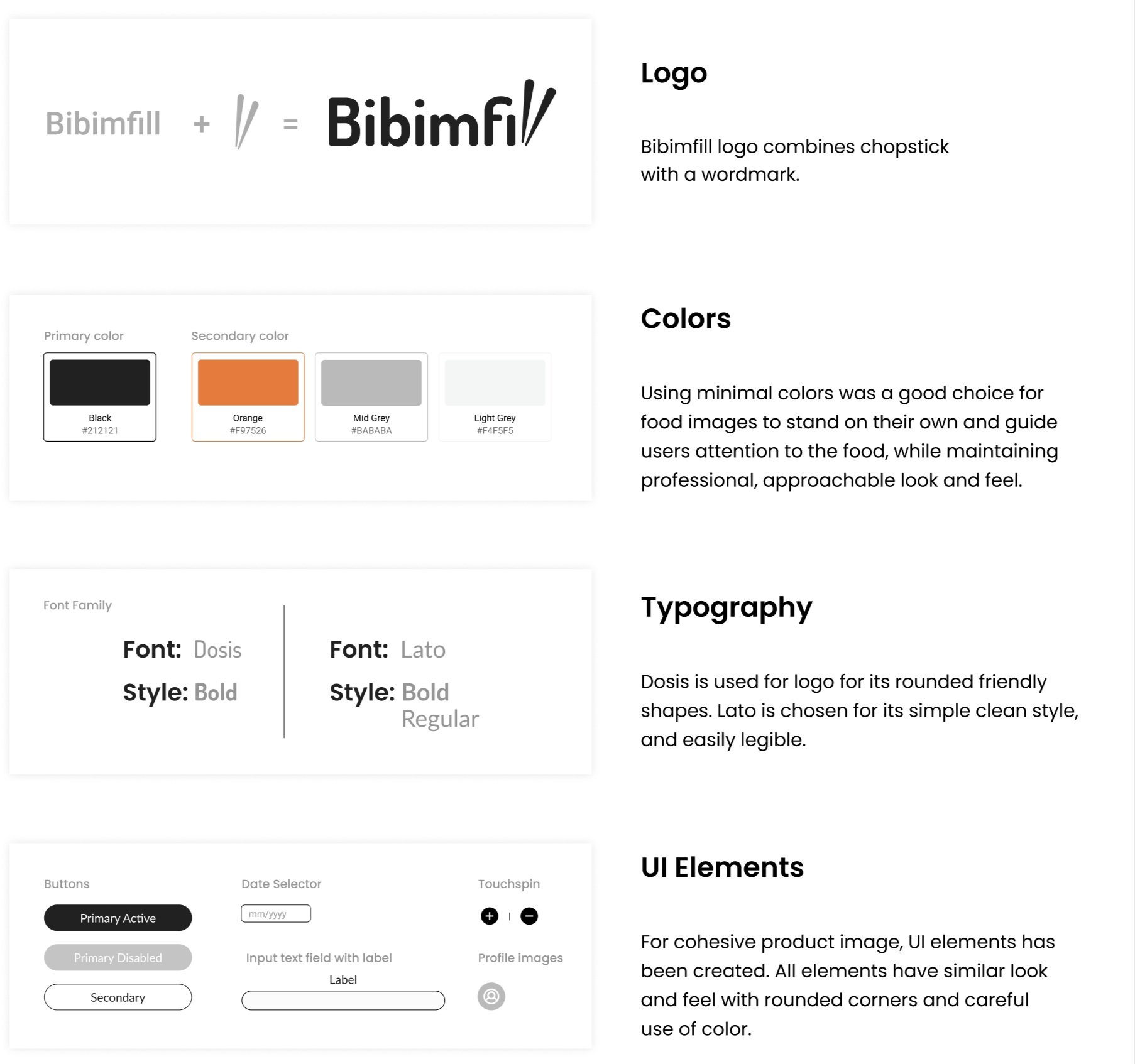
Style Guide
Final Product
Used indicators to help users to see their place on the screen/page
I made use of grids and hierarchy guidelines to help put everything on my screens.
Used “single page” layout: where all important information stays put on the desktop version.
During research and user testing, I discovered that users prefer to know what is expected from them upfront and in one place. For instance, users can see what they need to provide to place an order on the order page without opening a separate page or waiting until they add items to the cart.
What can be improved?
From here, I want to create an easily understandable order tracking process for customers to track their placed orders. And the use of some fun little animations would be very beneficial to create emotional design in places such as delivery radius confirmation and order confirmation.
Thanks for scrolling!
If you have any feedback or want to collaborate or say hello, let’s get in touch!